In a previous post I uploaded some pictures of what we had designed for the Magazine advertisement - our original idea consisted of our lead character with his guitar. However, in class we came to the conclusion that we didn't like the final pieces as they didn't look professional or fit the 'look' we wanted it to have. We decided that we wanted a new picture to be used, have less writing making it more about the song and our character being the main focus. Taking all of the new idea's into consideration I designed two new ideas;

This first design uses the image that is on our CD didgpak front cover - this helps the same theme flow through and 'fans' could recognise this. It also contains all of the relevant information - when the songs out, who's featured in it, short reviews, where you can buy the CD, website links to the band and also has a smaller image of the actual CD digipak.

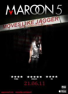
This design is complete opposite to the first design, it has a still image of the main character taken from the music video - it also has a 'headlining' banner which you would usually find outside a concert stadium. This design is different to the first for many reasons, it also doesn't contain as much information, however it has the main points - who's featured in the song, the artist, review ratings, links to websites and where you can buy this song.
After talking to the rest of the group, we decided that we liked the second design better as it's very unique and not something you would usually see. As I personally thought the design was slightly plain, I went onto develop it slightly - these were the outcomes;
This design is the same as the previous one, but I decided to add the release date to the bottom - I did this because I thought it look a little to plain. Once adding this I was much happier with the overall look of the magazine advert.

This one is also similar to the design above, I have just added the 'OUT NOW' to it - I wasn't sure if it made the bottom look overcrowded but Bijal said she preferred this one.
Even though the overall design is quite dark, it adds a mysterious feel to it - this is what we feel at the beginning of our music video as we can not see our main character all at once, but in parts. It also carries the red, black and white theme, which is used through out our digipak.

0 comments:
Post a Comment