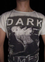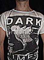

For our digipak we planned to have a set of four instead of six, for the left inside page we decided that we wanted to have our lead singers body as it follows our mysterious theme, from the video. During a day of filming Bijal took the pictures and gave them to me so I could edit them in Photoshop - these were some of the designs I came up with.


After talking to the others we decided on which idea we liked best - this being the bottom right. After eliminating the two on the right, we were left with the two on the right. The top image looked good however we thought the squares made it look weird, this wasn't the look we wanted it to have. We chose the one on the bottom right as it had a unique look to it, the others didn't really follow the themes that we wanted.
For the page where the CD is placed we decided that we wanted a peace sign to be used - mainly because it's featured in our music video and because it has a round design. Our initial ideas consisted of having a pink peace sign; however we realised it didn't follow the red theme. After thinking about it we decided to use a zebra printed peace sign as it connects to the video and follows the colour themes.


0 comments:
Post a Comment